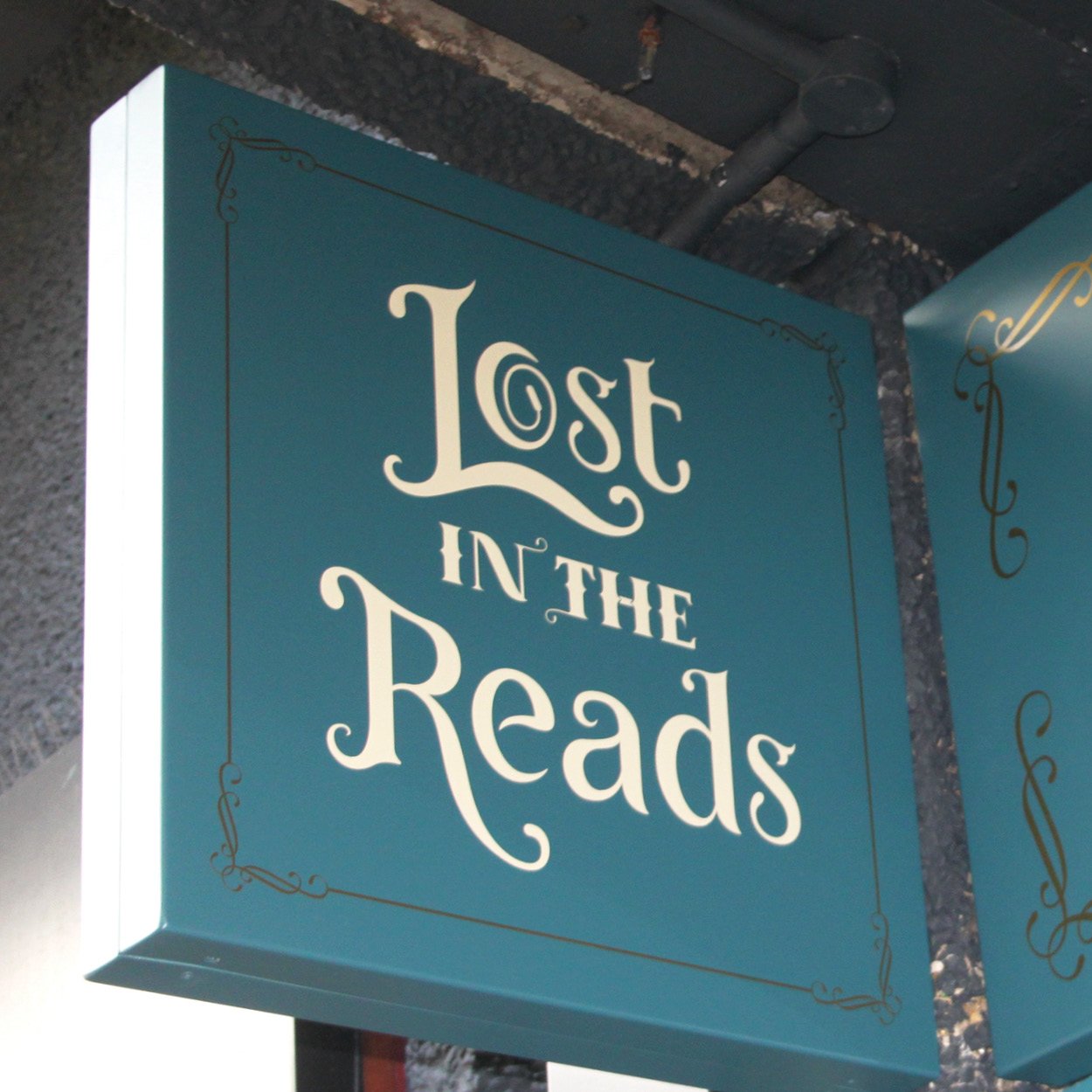
Its been an absolute pleasure to bring this lettering to life, working for The Lost in The Reads bookshop. Featuring a bespoke typeface crafted originally by hand, bringing the idea of forest and fantasy together, through a letter.
Jay truly enjoyed this journey for project that is close to the heart, for lovely people who have created a lovely space for people to look, read and relax. Featuring a beautiful shop front display with a stunning set of brand assets.
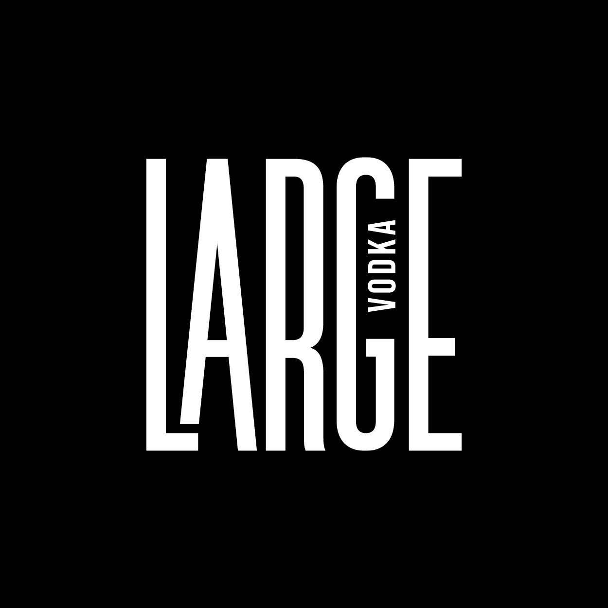
Jay was approached through an agency asked to create a logo and label design for a vodka brand.
Originally they had the strap line of ‘Avin it Large’ which was reminiscent of Kevin and Perry go Large back in 2000. Their audience was for a younger generation and so the phrase now felt outdated. Opting to use just ‘Large’ as the name was a good compromise to capture the vibe they were aiming for, while bringing into the present day.
Jay created a bold custom lettering idea, which worked with the tall bottle selection that could be easily adapted for all the other flavours. The letters indicated tall buildings with the circle being the sun setting behind them. The circe simply changed colour for each flavour, creating a simple and adaptable design that worked well for smaller bottle sizes too.
The brief was to design and create an exclusive label set for The Royal Horticultural Society’s gin, rum and whisky, in collaboration with The Harrogate Tipple Distillery. This brief stated the importance of paying homage to RHS’s floral designs and garden history.
The geometric maze pattern on the front makes a snug little home for the drink name and is inspired by the knot garden and pattern designs, dating back to the early 1500’s.
Beautiful flowers and patterns were carefully selected from the hundreds of hand painted and drawn botanicals from the RHS illustration library. A beautiful bold colour palette was chosen to stand out on the shelves, which complimented each label and their respective patterns.
An original logo drawn from scratch for a local restaurant and coffee shop.
A mixture of original lettering was also created for the main blackboard and interior signage.
This was all drawn by hand bringing a personal touch and flair to each piece of their interior signage.
Design and art direction for Harrogate Tipple’s gin and rum collections.
The brief was to make Donnie the Otter as prominent on the bottle as possible. A fresh new colour palette was introduced to ensure the bottles looked great as a full set standing next to each other.
Fine botanical illustrations were drawn for each flavour and the labels were finished with gold foiling and high screen build.
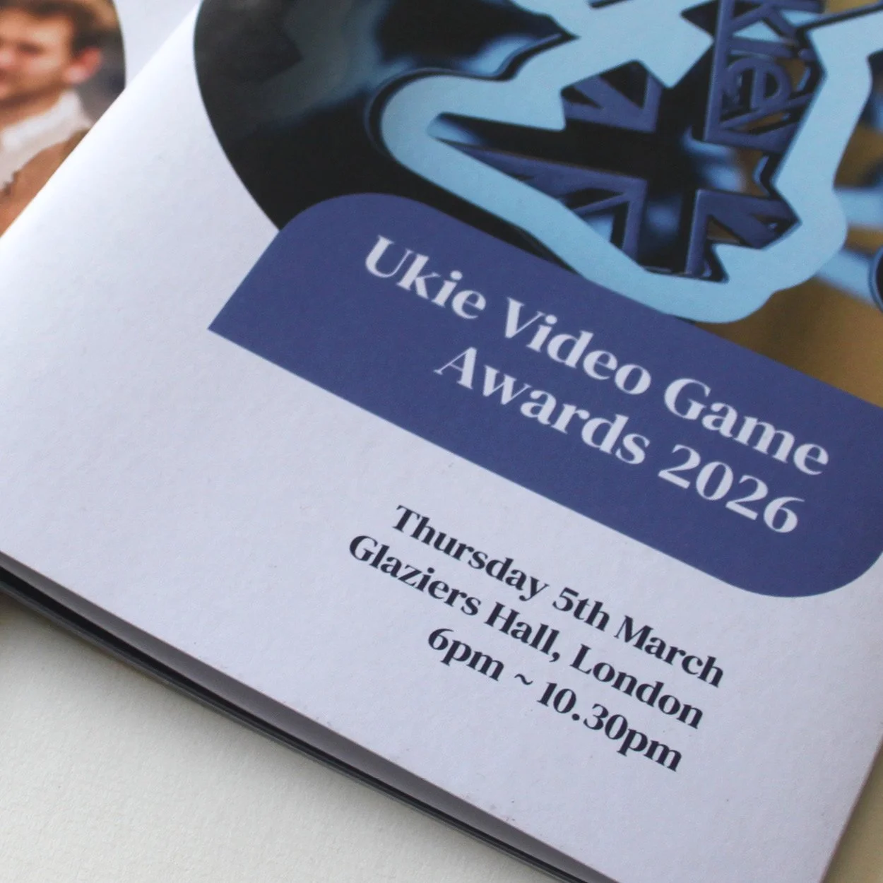
Jay Roerade has worked alongside Ukie for 12 years now. Since 2023 he has designing their yearly design assets for the UK game awards and members day.
This brochure, showcases the award nominees and sponsors and selected games. Featuring a nice 6Pp fold out mailer with booklet inserted back pages, printed on 100% recycled paper.
Jay worked with Philippa Haynes, Angela Hicks and the Hive team for their fresh new re-brand. From logo, through to website look and feel, printed stationery and signage. Its wonderful to be working with people who are helping the future generation in an environment that is self sufficient.
Jay embraced the opportunity to work on a great project and thank you to Sam Grimshaw for bringing this to life in the digital world, alongside Alpha Wilson for the typographic animation work.
Jay has worked with Harvey David for over 10 years, helping with varies client projects. Its all started back in 2015, when Jay was asked to create their original logo.
He created a bespoke typeface for the HarveyDavid name, which reflects a classic foundation with modern tweaks. This encapsulates the idea of bringing old traditional values into their new ways of working with technology.
Jay has worked closely HarveyDavid helping them with creative campaigns for clients such as Ricoh and Lloyds bank.
A brand design that speaks to the concept of image and elegance. This is highlighted in every output from stationery, website to press releases and invitations.
Jay Roerade joined them for this project at the beginning and the branding was greatly received at their launch.
Jay Roerade has worked alongside Tosin’s & Co starting with branding, leading to complete art direction for the company.
This included everything from copywriting, online presence, newspaper inserts to brochures and T-shirts.
Complete project management pushed the envelope for the expression of this luxury homeware company.
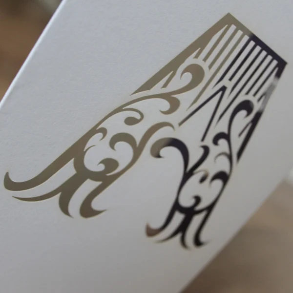
Working with moonpig.com and Photobox, Jay Roerade was asked to create an alphabet for an exclusive card range, featuring a lasercut letter on the front of a card.
His experience with drawing letters for many years brought this project to life. Influenced by Tuscan style lettering, Jay created each letter by hand and then refined into vector format, creating an alphabet of beautifully crafted letters.
A fine range of papers for this card range completed this unique project.
In 2017 The Rocky Horrow Show Touch Me Game was released. Jay Roerade was asked to help with the Logo design, two colour T-shirt print, stickers, posters, banners and app icons. Completing the collection is a limited edition vinyl release.
The vinyl packaging was designed by Jay, featuring a collage of old newspaper cuttings and recent character designs from the game, making a time line from past to present.
Land, Air and Water is the theme behind this clothing brand, based around extreme sports.
The brand mark was created using the greek symbols for these natural elements to really give the logo a meaning. Rock climbing, kite surfing and boarding were all used in the illustration to go on the back of the shirts.
A logo label was sewn at the bottom and hand printed wrapping paper finished off the presentation. Truly encapsulating a company’s ethos in this design and an intelligently thought out logo that is also visually stunning.
Branding for a wildlife gallery all hand drawn with a unique but personal feel.
Lovely sweeping ligatures represent the fineness of the artwork featured in the gallery.
Gold foiling on high quality recycled paper put the finishing touches to their printed stationery and business cards.
A complete bespoke hand drawn alphabet designed for a homeware range of products.
This was provided as vectored letters, so the client could apply to any fabric or material with ease.
Exceptional attention to detail and consistency across all letters combined to create this stunning typography.
Complete logo and packaging design for Devonshire Tea.
Taste and history are brought together with a traditional package for a beautifully
refined appearance.